Data Insecurity

In the modern age there are hundreds of companies that have access to its users personal information. Many companies require some sort of sign up process for first time users. This often involves the user giving the company their name, address, birthday, and in some cases even more sensitive information such as a credit card number. Most people do not expect this data to be leaked around the internet, but it happens quite often. When a data breach occurs, the sensitive information that is gathered is likely put up for sale on different dark web sites for anyone to purchase. This type of information breach can happen to any company, even if they might not seem like they would have much sensitive information on their customers. For example, Panera suffered a massive data breach last year where the data of 37 million customers were exposed. Here is a website that talks about some of the other biggest data breaches of last year, and dives more into the specifics of each breach. The cyber criminals that are responsible for these data breaches continue to find new hacking methods to uncover this data. So since any company seems to be susceptible to these data breaches, what can be done to improve data security and keep everyone’s data safe?

Big companies use a variety of techniques to keep their customer’s sensitive data safe. At a purely physical level they have many policies to restrict the possibility of a data breach. For example, many companies use encrypted hard drives to store information, encrypted USBs to protect moving data, and also encrypted phones to protect data shared through telephone. Many companies have policies that require theses devices to be used, and also extra policies about employees own devices. Employees are often required to use a laptop or other device that has no USB slots, and is not able to download or export data over cloud. This is to prevent data from reaching outside sources by employees. A statistic that I got from this website (also a very interesting article) says that ignorance and negligence from employees cause 54% of all data breaches.

Many people also falsely believe that the big companies just have all the data encrypted, so it would not be accessible anywayss, but that is often not the case. Most large amounts of data from companies get stored in a relational database, as it is the easiest method of storing big data. However, it is difficult to encrypt data that is stored in a relational database, so whoever has access to it can often just read the data inside. Encrypting a database is also very expensive when you are purchasing that database from another company. All companies should be required to encrypt their customers sensitive data. It is a major violation of data integrity.

People tend not to think very often about how much information about their personal lives are truly out there for companies to sell around. We have no real idea how well protected the data, that we casually enter in when registering for a website, truly is. Most likely it is going into a database with no real protection at all! Data security still has a long way to go, and certainly more companies need to start implementing better encryption of their customers data. We all need to be more careful with our sensitive information, and pause to think where exactly the credit card number we are entering in is really going.

Nick Bagley
Graph Overload

There are hundreds of different types of graphs that a person can use to represent data. This often makes it difficult to figure out which type of graph is the optimal choice to display the information most clearly. Different graphs are good for different purposes, and in this post I will discuss a few of the key graph types that can be used in common situations.

If the data that is being displayed is not overly complex, then often times the simplest graphs are the best to use. The basic bar graph is good to use when comparing different numerical values against each other. For example, if data is gathered on several group’s opinions on a topic, a bar graph is an easy way to represent the number of people from each group that favor one opinion or the other. This kind of graph is also very useful in a financial standpoint, allowing for different dollar amounts to be compared between different time periods or companies. Another very simple yet powerful graph is the line graph. This graph is mainly used to represent trends, which clearly shows if a certain data set is increasing or decreasing based on the parameters. One of the most recognizable uses of this graph is in representations of the stock market. It shows the trends of different stock prices, and allows the reader of the graph to very quickly identify which stocks have an upward trajectory and which do not. Both bar graphs and line graphs can be understood without much analysis, making them very useful for quick and easy representations of data.

While bar graphs and line graphs are very useful in industries such as politics and business, they are not as widely used in the more scientific fields. The kind of data gathered through scientific research does not always make sense when put into these graphs. This is where graphs such as scatter plots are useful. The scatter plot allows two variables to be considered, and when the points are analyzed a relationship between these two variables can be found. This is helpful for scientists to find patterns in their data and make new discoveries based on connections that would not be able to be seen otherwise. Spider charts are also very useful in the scientific world, allowing for more than two variables to be considered for the data. A single entry can be considered against multiple variables around the circle of the graph, and additional entries can be compared in the same graph by having a color key present. This allows scientists to identify the entries that are best suited for a specific variable, and which are far below the competition.

While many graphs purpose are to display data in the most efficient manner, there are also times where the goal of a graph might be to be understood as simply as possible to a large group of people. These are graphs that may want to be used for presentations in a meeting for a large number of people so that the main idea can be communicated clearly. A very strong example of a graph in this category is the pictograph. This is a graph where the data gathered is translated into pictures so that it can be easily visualized by the audience. Venn diagrams are another graph that audiences easily understand. The venn diagram clearly shows two opposing sides, and shows the audience where the two intersect and where they have their differences. While these types of graphs are not necessarily the best for representing complex data, or even simple data, they can have a strong effect on an audience because of how easy they are to understand, and how they do not force the audience to analyze raw data too intensely.

There are many more kinds of graphs that can be used in a number of different situations. While some are hard to read, and some have very specific usage, there is a graph for every data set. This website shows a large number of different charts and graphs, many of which I have never seen before. New graph types will be created constantly with all of the new types and representations of data being introduced in the modern world, and it is important to keep all of these graphs in your arsenal when dealing with the unavoidable mountain of information in today’s age.

Nick Bagley

Life in Diagrams

There are many complex processes that take place in the world, most of which would be incredibly hard to explain using only words. People have a hard time expressing what is inside their minds, often causing miscommunications when trying to explain their ideas. This causes the person who is listening to this idea to receive a less efficient version of the process than what the original person knows. Now when they go explain the process to someone else using only words, the same thing will happen and the listener will gain a less efficient version of the process. This will continue to happen, basically creating a giant game of telephone, until somewhere far down the chain the process is almost completely different than what the person who came up with it intended. This leaves all of the different members of the company with a different idea of how to complete a task, which can cause many problems for obvious reasons. It is crucial for all members of a company to follow the same processes so that their tasks get completed. This is where diagrams are an absolute necessity.

The flowchart began to be used heavily in the 1930’s. The first industry to adopt widespread use of these diagrams was the industrial engineering field. The diagrams depicted the steps of different engineering processes so that all people involved in the process could have the same understanding of what needed to be done. With a proper guideline to follow, the processes became much more efficient, because the diagram could be analyzed and made to follow the most efficient steps to take in the process. However, before computers, analyzing and altering massive industrial flowcharts was a huge process in itself. Some of the flowcharts that were made for complex processes would have hundreds of steps and connections. Since they were written out by hand at this point in time, adding in a step, or changing an existing step, could completely change the way all of the connections worked in the diagram. The entire flowchart would often have to be remade to accommodate one extra step, since erasing and rewriting hundreds of lines and boxes made the diagram extremely messy. Now with modern technology, complex diagrams are much easier to create, alter, and store. This allows companies to rely more heavily on flowcharts for processes, maximizing efficiency. Multiple virtual copies of these charts are stored in databases, not on paper in files like they used to be. This means different people in the company can access them to understand the process better, and the entire operation can run much smoother. This ease of creating diagrams in the modern age has caused process charts to extend outside of just commercial use, and into the daily lives of people.

There is some sort of diagram on the internet for just about any sort of process imaginable. Here is the link to a site that shows a list of comedic flowcharts used for all sorts of different purposes. While the flowcharts on the website are obviously not very practical and are meant more as a joke than anything else, they can still actually be followed and ultimately do work. This just shows that truly anything in the daily lives of people can be represented as a diagram. Simple processes often do not need a diagram to make them more efficient, but they can still be made. If a person were to have a diagram for every process they forego in their day, with each diagram having the most efficient steps for completing the process, then the person would likely complete everything that they would have accomplished in half the time. Humans by nature do not follow the most efficient way of doing things. We are certainly capable of finding the most efficient way, and then following the diagram that explains it, however for most things in life we do not analyze processes for efficiency. Mapping out everything that a person does in diagrams would certainly make them accomplish their tasks quicker, but there would be no spontaneity, and ultimately that person would likely feel less human. While diagrams for large processes are extremely helpful, perhaps they should only be made at this larger level, because planning out simple processes in a person’s live can start to make living itself feel like a process, and that is something we certainly want to avoid.

Nick Bagley

Genetic Databases

Databases are used to store all sorts of different information across many different fields. The health industry utilizes databases to solve a multitude of problems through research and analysis on the data. An example of a type of database that is used in the health industry is the genetic database. These are databases that contain information about an organism’s genes, DNA variants, and much more genetic information. By having access to thousands of different organism’s genetic information, scientists can determine patterns in DNA to conclude which genes might be responsible for certain effects in the organism. This method of analysis is helping scientists determine the cause of some of the world’s biggest biological problems, including the father of them all; cancer.

There is an extremely interesting project going on in the health industry called TACCO, which stands for Transcriptome Alterations in Cancer Omnibus. This is an example of a genetic database, containing information on altered cancer genes. Through analysis of this database, researchers can make conclusions about risk levels for different types of cancers in people. Through analyzing the empirical data stored in TACCO, scientists can come up with numbers for the risk probability of a person with certain genes developing a specific type of cancer. For example, if the database contains one thousand instances of a person with a modified gene type A, and ten of those people developed brain cancer, then a link between people of that gene type and brain cancer could be made. If a patient with the same modified gene type A is seen by a doctor, the doctor could use these statistics to determine that this person has a 1% chance of developing brain cancer. The data in this database can also be used to determine survival rates of people with certain types of cancer based on their genetic makeup. There might be an extremely low survival rate for a specific type of cancer, let’s say 2%. However, through analyzing the data in the database, researchers could find that every person who had gene type B survived this cancer. This means that if a person with this gene type is diagnosed with this specific cancer, there survival rate would be above the normal 2%. Even more crucial, this would allow scientists to study this specific gene and figure out what it is about it that allows the people who have it to survive. This research could ultimately result in a cure for that specific type of cancer.

The information in these genetic databases are looked at in different formats to determine patterns. While a pattern between a certain genome may not be evident when analyzing the database itself, it might surface when the database is represented graphically. The information needed to find the causes and cures of earth’s biggest diseases might very well be there in these already existing databases. Now researches and scientists must deeply analyze this data in different ways to extract the patterns hidden among the lines of data. We are getting closer everyday to reaching these cures, and information and data scientists are needed more than ever to find them.

Nick Bagley

Data Encroachment

Most people would say that privacy is a crucial right, however big companies and organizations, such as Google and the federal government, have been pushing the boundaries of privacy. The average person generates approximately a gigabyte of data everyday, and more of that data than ever before can now be collected and used in different ways. However, many people do not want this data to be collected from them. A recent example of data collection going too far is the case against Mark Zuckerberg and Facebook last year. Here is a link to the article on the case from the New York Times, including a video of Zuckerberg’s testimony. Many people are outraged at the fact that their data can be harvested and seen by huge companies, and often times sold to other companies so that your private information has spread to many different areas.

This invasion of people’s data has caused people to alter the way they use the internet. Most people will at the least have some sort of cyber security system on their browser, such as a firewall. Many people are intent on making sure their privacy is kept, which springs up products such as a tabs for devices that cover the camera so that nobody can access it. While many people do not think that so much personal data should be collected and seen by others, there is a strong counterargument. More collection of data means major possible improvements across many different fields.

The health industry is an example of where an increase in gathering data could help a multitude of people. With modern technology scientists are able to create a device that people can put on that tracks a person’s heart rate, blood pressure, and other vitals at all times. This device can warn a person if there is an issue such as an upcoming heart attack so that they have enough time to seek medical help before it actually occurs. This device would be constantly gathering data from a person’s body, which is exactly why many people would not want something like this hitting mainstream usage. The human body generates about two terabytes of data everyday, and this technology is able to collect all of that data. This means that there could be thousands of different people that all have information on things like a person’s heartbeat at all times. This is seen as an invasion of privacy to many people, which is why limiting the misuse of data is an issue that the government pays strong attention to.

Data collection is used by companies to make the lives of their customers better. Sites such as Google collect an incredible amount of data from users which allows them to provide relevant advertisements and accurately predict what the user is going to search based on their past. However, when does this begin to invade a person’s privacy? Google could gather the data from a hospital showing that a patient just had a child. Then they would use this information and advertise products for babies and new mothers to the patient. This sharing of information between different companies and across industries is where people believe their privacy is intruded upon. Companies continue to try and collect more data and push the boundaries of privacy, and this is where we will see a true data encroachment.

Nick Bagley

Python vs. R

Back in 1991, Guido Van Rossum introduced the world to his new programming language, Python. The language entered into mainstream usage quickly, but only several years later, creators Ross Ihaka and Robert Gentleman created another programming language, R. Since then, both languages have been used heavily in the data analysis field. But which language is better? Since 2013, Python is being used by nearly four times as many people as R. Python has the fourth most active usage on Github and Stackoverflow, while R lands at 15th. However, that does not necessarily mean that Python is a better language for data science.

R is completely centered around data and statistical analysis. Data can be analyzed in tables, and manipulated with simple strings of commands. R provides it’s users with a plethora of base functions to extract information from data sets, and by combining these simple functions it is easy to produce a more complex command. Typically, R is not taught as a first programming language because it is known to be more difficult than languages such as Python. However, once the basic syntax is understood, it is easy to dive into everything R can do.

Another advantage that R has over Python is it’s code repository. R has a massive availability of packages to install, all available at CRAN, the Comprehensive R Archive Network. Python has a similar repository called PyPi, but it is not as heavily contributed to. This wide selection of packages allows R to continue to grow, while Python does not focus as much on the usage of packages.

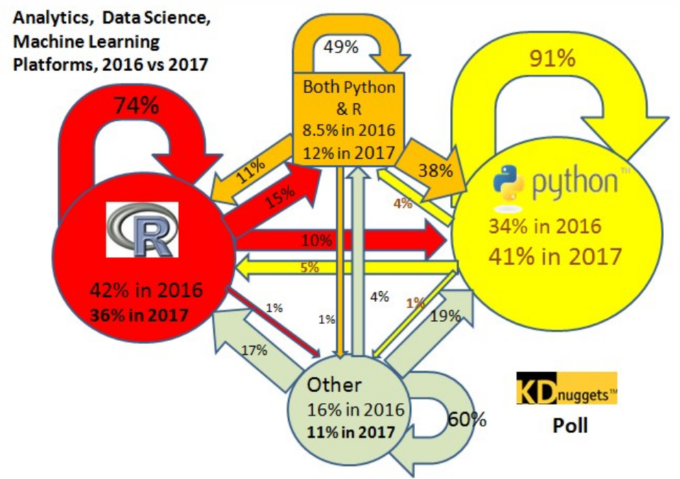
However, with all of these advantages, Python is beginning to raise in popularity, looking to overtake R. As seen in the diagram below, more people are switching over to Python than ever before.

The world is becoming a greater environment for engineering. It isn’t only computer scientists that know how to code now. People in all different fields use some sort of coding in their occupation. That is why the adaptability of Python is beginning to take precedence over the raw functionality of R. Python code is easy to read, which means that people in different parts of a business can understand the code, even with no real knowledge of computer science. Python can also combine data analysis with programming better than R can. Python is much more applicable to engineering purposes and development purposes than R is, and there is more development happening in the world than ever before. This is why Python is becoming dominant in the world of data science.

-Nick Bagley

Swimming in Data

The first true form of data storage for machine use are punch cards. They were invented in 1725 and continued to be used commonly for centuries. They were cards with holes in them, and these holes represented instructions for the machine to follow. The most common uses for punch cards early on were textile looms and self playing pianos. These punch cards were easily understood by both humans and machines. By reading the documentation on the punch card, people could easily understand what the holes were supposed to do. For people to share this data, there would simply be increased production of the same punch cards. People use replicas of the same data to make machines carry out the same tasks. There was no need to go to computer science school to understand how these punch cards operate. Data storage was at a very elementary level, and there were no special languages required to extract the data and use it somewhere else.

It was not until 1948 that the first instance of RAM was introduced. Frederick Williams was able to store 1024 bits of information digitally. Intel started to release the first computer chip in 1966 that stored 2000 bits of information. Soon after external hard drives began to be made. Floppy disks and hard disks were introduced. However, even though there was more data able to be stored than ever before, it still was not easily transferable. To access this data, the physical drive had to be present, and the machines had to have a drive to access the data. There was no cloud where all of the information went. The data storage continued to improve. SSD cards and flash drives were invented in the 2000s to continue to make more storage and smaller physical chips possible.

In 2006 the term “cloud” was finally introduced. More data was being produced than ever before. Here is an interesting website that has a lot of interesting statistics about the amazing increase in data. By 2020 1.7 megabytes of information will be generated every second. This is the point in which data becomes difficult to access and to transfer. With the large amount of programming languages used it becomes harder to write universal programs manipulating the data. This is where XML files are necessary. The method of using XPath to access data from XML files is crucial to the sharing of this data.

Before information was accessible to everyone through a cloud, there was not as strong of a need to digitally transfer data between databases. However, now that it is possible for multiple people to access the same data, the question of how to efficiently manage it becomes increasingly more prominent. Data can be lost in a data lake, making it very difficult for anybody to access if it must be used. That is why it is important to have some way of transferring data into an XML. Once the data is organized in an XML format, the universally known XPath language can be used to access certain pieces of the information. Before data is generated, the software that generates it should have a way of storing that data into an organized store. This way the data can be utilized across different languages and machines. More data is about to be introduced into the world than ever before, and we cannot let it become lost.

-Nick Bagley

Design a site like this with WordPress.com
Get started